
One design standard
one platform
for every department
iNET Design System provides design principles, standardized UI components and automation tools that keep the digital experience consistent across the company and speed up delivery for every department.
Portal Hub: Zones by Role
Whatever your department, the iNET Design System has a dedicated resource area to streamline your daily work.
Developer & Outsource
Ready-to-use component code, API docs and Storybook integration guides for multiple tech stacks.
- 54 Vi* Components · 12 Design Styles
- 44 MCP Tools · 290 CSS Tokens
- Storybook 10 · Nuxt 3 · Vue 3
Marketing & Sale
Banner standards, PowerPoint templates and on-brand communication content.
- Banner color rules
- iNET presentation templates
- AI Prompt cho content
Brand & HR
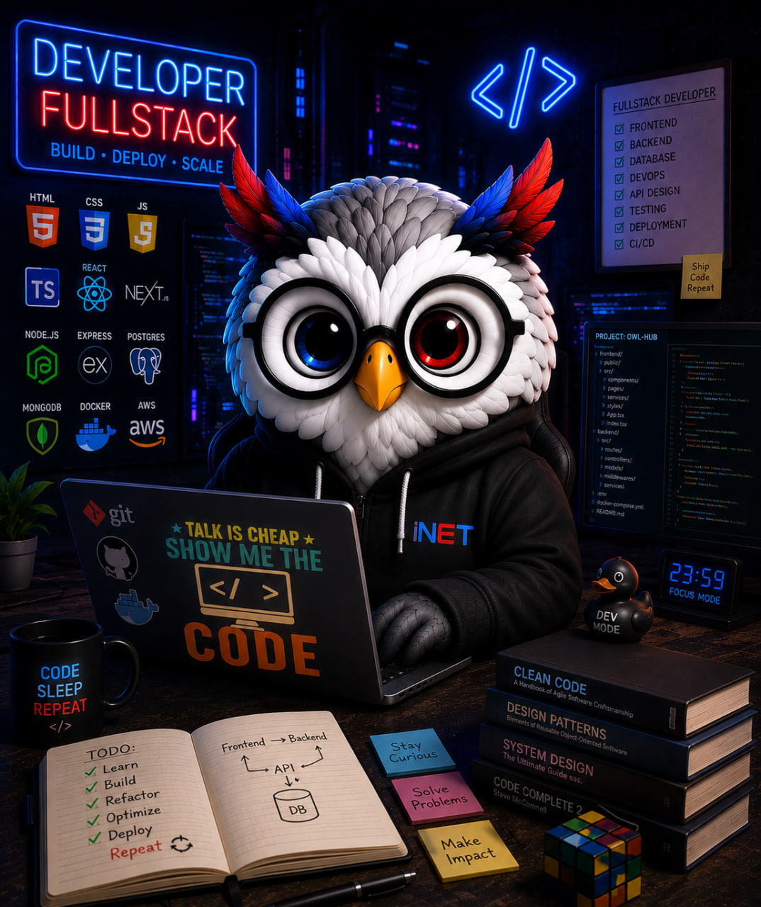
Official logos in every format, the iNET Owl mascot, email signatures and internal documents.
- Complete iNET logo set
- iNET Owl mascot 2026
- Standard email signature
Designers (In & Out)
Grid rules, primary/secondary palettes, typography and iNET layout logic.
- UI/UX layout principles
- Figma guide (reference)
- SVG icon library
Core standards
Taken from iNET Brand Guidelines v2.0. Click a color to copy its HEX.
Official brand palette
Click to copy HEXPrimary colors
UI & secondary colors
Typography
Optimized for iNET web & mobile interfaces. Full Vietnamese support.
Headings use Black / ExtraBold
font-weight: 800–900
Body text uses Regular (400) for comfortable, clear reading.
JetBrains Mono
Token names, code snippets, mono labels
Logo usage & clear space
View the full Brand Style GuideMinimum size
Clear space
Keep a clear space around the logo equal to the height of the letter "i" in the logo. Nothing may be placed inside this area.
Do / Don't
- Use on white or dark backgrounds with enough contrast
- Keep the logo’s original proportions
- Stretch or distort the logo
- Change the logo’s colors
- Place it on busy, multicolored backgrounds
UI Playground
Explore 290 design tokens, 5 DNA themes and the CLI + MCP Server toolkit of the iNET Design System.
/* Use tokens in CSS */
.my-btn { background: var(--brand-primary); }
.my-card { padding: var(--sp-16); border-radius: var(--radius-lg); }
Changelog & Roadmap
What each month delivered, and what comes next.
Roll the shared UI kit out to every team
The website, admin panel and OneDash share one set of colors, type, buttons and icons instead of each team rebuilding them. The wider rollout happens only if October's review passes.
Final review before the wider rollout
Bring all 10/10 quality standards up to scratch (6/10 at the start of the month) and resolve 24 open requests from the team already using it. At month end everything is re-scored: if it falls short, the rollout moves — the bar does not.
Raising the quality bar for the shared UI kit
Every release that changes the interface now compares screenshots against an approved baseline and checks that text stays readable for people with low vision. Fixed the cause of 37% of bug reports: the AI assistant missed design values typed in a different spelling.
Display fixes, getting ready for real users
Fixed every issue that made text hard to read on light and dark backgrounds, plus 90 icons that rendered wrong. The goal of Marketing building a landing page alone in 30 minutes was not tested yet — postponed because the admin panel still lacks an image picker.
Tools for Marketing, a bigger icon library
5 landing page templates built quickly with AI assistants; 713 icons gained a two-tone style; automatic readability checks began; verified that 7/7 important security holes were closed.